Monday, February 1, 2016

How to use PolyPaint and Spotlight Projection

Polypaint is a tool in brush that allows the creator to paint right on the model rather than painting on the UV map/layout in photoshop. It gives the creator more room to paint detail exactly where they want it to be. Using Polypaint and spotlight projections gives your model life. You don't just have to paint in polypaint, you can import an image into texture and using spotlight projection you can "paint" in the picture that you imported. This is useful for things such as realistic skin detail, eyeballs and things that are difficult to paint.

Turning on Polypaint
On your right menu, scroll down till you see "polypaint". Turn on colorize.
Once that is on. Turn on your RGB and turn off Zadd or Zsub
Also add the color menu to your side bar for convenience
You are now ready to use paint on your model. Size,brushes and opacity are the same tools you would use for sculpting.  ( In Alphas, draw size..etc)


But lets say you want to add paint on real skin texture.
Heres how:
Make sure your polypaint is turned on. Go into your "textures" menu and import a picture in. 


Put the image into the scene on top of you model. Z to turn on the options and turn on the "paint" button
Turn on Spotlight projection.
and you are ready to paint on the skin.  Paint like how you would normally but instead of just a solid color, Zbrush will project the image on to your model.
you can also press fillObject and it will fill the whole model with that image.

As you can see, the image is projected on to the model where i painted it in. Here's another example with an eyeball.

In conclusion, polypaint and spotlight projection is a great way to pay 2D textures to your models. It make make your model look more realistic and saves time. You can also export your polypaint to be used as a texture with your UV map.


Monday, September 14, 2015

Compare and Contrast


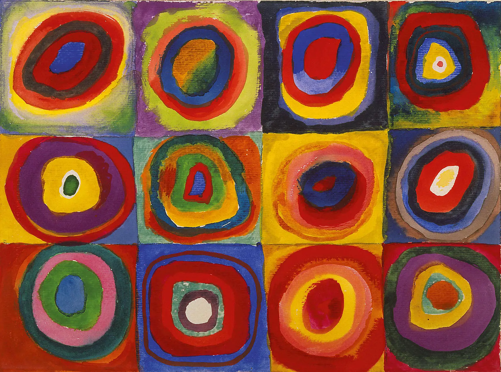
This is my finished art work. It is of a girl wearing a scarf and a headpiece that -somewhat- matched the original piece.  Even though there are many things different there are also some similarities. Some things that are similar is the pattern. They both have the circle pattern through out the piece. It can be seen through my painting. In the hair, in the scarf and even in the eyes. Also both use contrasting colors.  Both have movement, even though its different types of movement. The original's movement is based on the changing size of the circles. My painting's movement is from the hair and scarf. Some differences is the way the pattern is used. I used mine to fill in spaces such as the scarf rather than have the circles as the main focus.  In mine the main focus is the girl. Mine also have more depth because it does have a human subject I could add more depth to it.

Work in progress


Objective critque

This work of art by Wassily  is an abstract piece that is done with many circles within circles. Each ring or circle has a different color. Some colors mix with each other and come compliment each other. These colors that he use are mainly primary colors but other colors such as green and purple can be seen throughout the piece but mainly the primary colors are used. This painting was painted in watercolor,gouache and crayon on paper.    Wassily used color and shape in this painting since the subject is mainly circles and squares . The colors he used is bright and vivid  because it seems that he was experimenting with colors and color mixtures. His shapes are simple and he keeps it only to circles and squares.  Throughout the piece you can he that he used pattern over and over again. The circle within the circles repeat to make  rings can be seen through the whole artwork. Another way he used pattern is with the squares. Each square had circles and each circle has more circles. This repeats in each square.  Variety is seen in this painting as well. Even though there is a pattern, there is still variety. No two circle color is alike and no two circles are the same. Some are smaller, some are more uneven.


Subjective Critique


My initial reaction to this is what is this piece suppose to represent. Like  most artwork, there sound be a meaning even if it is  sublime. With this piece I feel like it it is just circles of color and nothing else.
The piece is also very overwhelming to look at. A lot of colors is going on but they do not really match well. There is not many depth in it either. My taste in art is the opposite of this because the colors are too bright. This looks like pop art but its not. I do like that the circle repeat themselves.  I do not like how messy some of the circles either. Another thing that I do not like about it is that it is not even circles. They are just ovals and mushed up circles.
I am changing it by adding movement and a subject matter into the work. I am adding this because it will move the eye around rather than just in one area. I am also using this print as kind of a pattern for a fabric.

Sunday, September 13, 2015

Original Art work & Info

Color Study. Squares with Concentric Circles By Wassily Kandinsky

Finished in 1913

Materials:  Watercolor, gouache and crayon on paper

Size: 9.4 × 12.4
Current Location: Munich, Germany. Lenbachhaus Gallery